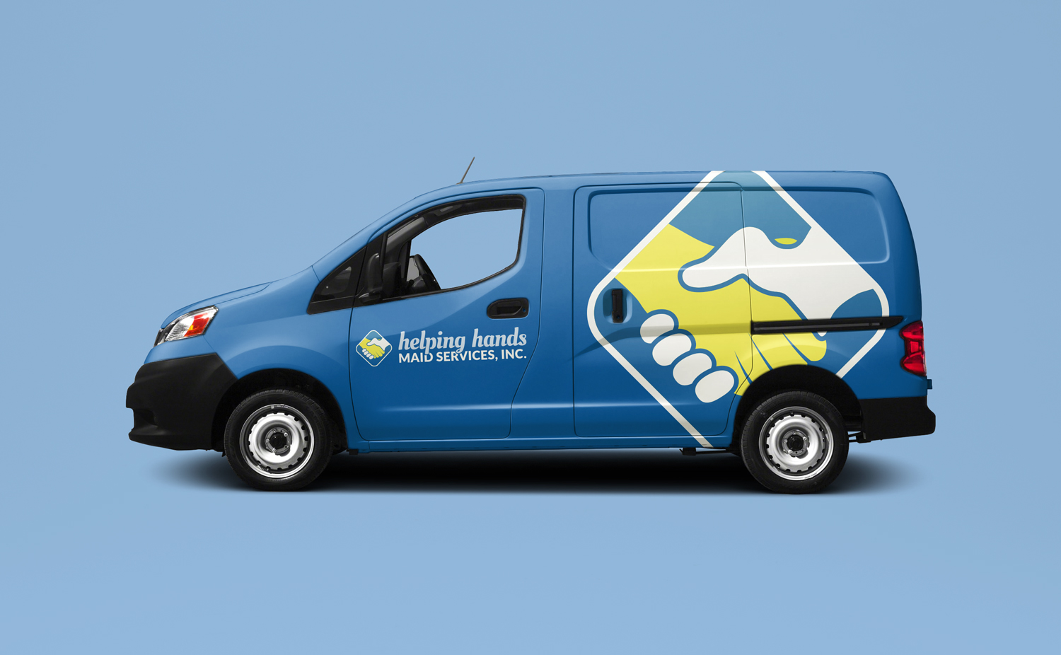
This concept created for a cleaning service makes use of a diamond-shaped mark that was developed to communicate the brand in a variety of settings, whether accompanied by the company’s name or not.
I used contrasting typefaces within the logotype to add emphasis to “helping hands” as it is the most distinctive part of the name, and also because it concretely relates the company’s value proposition.


