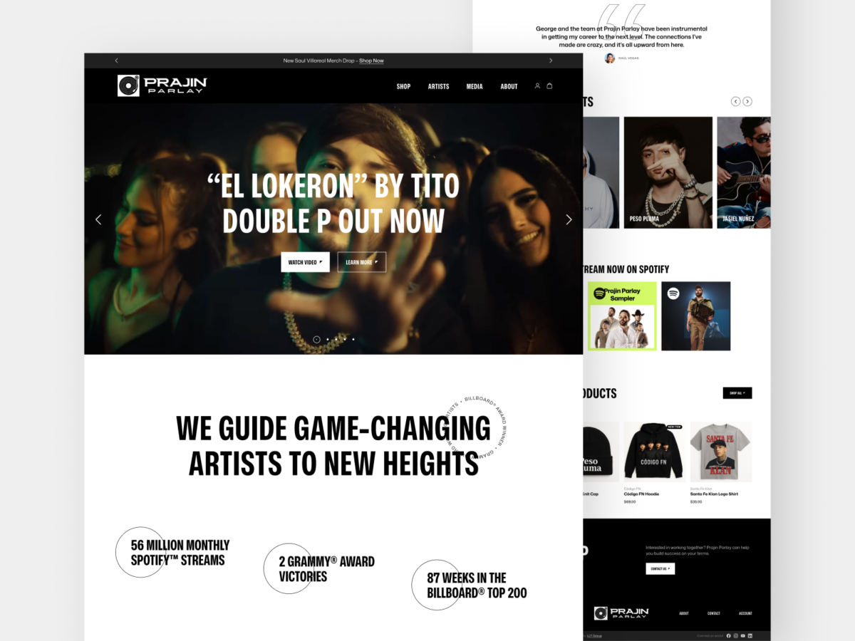
This client brings advanced analytics to trucking companies and helps them rapidly elevate their efficiency and decision-making. The company sought a redesigned marketing website that generates new business leads without revealing to their competitors proprietary details about their cutting-edge, AI-powered technology. I delivered an attractive new web experience that is visually cohesive to the company’s […]
Author: Ian
Created for an industrial recycling program, this concept was one of my favorite options conceived in the initial brainstorming phase. I had a lot of fun incorporating subtle graphic symbolism into the geometric typeface, making reference to the program’s function and also to the client’s corporate logomark.
The Lars Own website brings the tastes and traditions of Scandinavia to gourmet food lovers. The homepage hero section‘s video background incorporates footage of families enjoying Nordic dishes, Swedish landscapes, and sumptuous food closeups to set the atmosphere of the website and to place the products into context. With products being central to the website, […]
With the client wanting to steer clear of any typical “law”-related imagery, I leaned into the concepts that inspired the name of this legal services app: accessibility, communication, and a positive outlook. Because their platform directly connects users with expert legal practitioners, incorporating a speech bubble was a natural choice, and I found the avenue […]
My plan for this creative agency homepage was to go for something bold, featuring big, immersive type and some touches that have a friendly spin and take inspiration from the company’s new handwritten-style logo. I also aimed the content at communicating the idea that the agency doesn’t take on every client, rather focusing on doing […]
This healthcare client was looking for vibrance and energy in their redesigned website in order to communicate the experience their patients have at their numerous clinics. I used a combination of bold typography styles, bright gradient fills, and numerous interactive components to convey these qualities to users and prospective patients.
I had a blast creating this concept for a book I recently enjoyed reading. The design leans into a flat, minimalist aesthetic to convey the subject of this novel, which explores family relationships around a 1970s suburban Chicago church. This approach to illustration, containing only essential details but each element packed with meaning, greatly intrigues […]
To mark the NFL Raiders franchise’s 2020 relocation to Las Vegas, I thought it was time to consider a brand refresh that was more appropriate for the team’s new home, while retaining many of the familiar aspects that fans have loved for decades, such as the distinctive shield design and sleek silver-and-black color palette. The […]
In approaching the design for this e-learning course and landing page, I wanted to translate the client’s expertise and authority in the subject matter into an engaging, intuitive experience for the user. One of the challenges in creating the visual styles was to find the right tonal balance between the gravity of a serious pediatric […]
This logo for an online mockumentary series is geared to conjure up feats of superhuman strength – even if the show’s squad of heroes is slightly less-than-super. I had a blast working with the show’s production team to develop its visual identity, including logos for each of the primary characters. View the series trailer here.