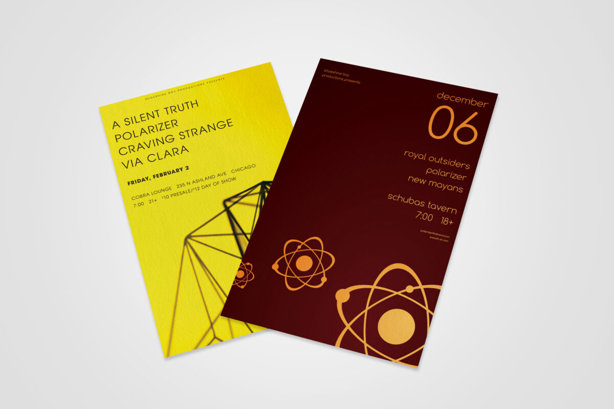
This series of concert posters represents the exploration of a minimalist, geometric-inspired aesthetic that tied in with an independent band’s musical genre and established visual presence. The cleanliness and uncluttered nature of the designs, as well as the high-contrast color choices, was helpful in that most concertgoers primarily digested them on mobile social apps, rather […]
Author: Ian
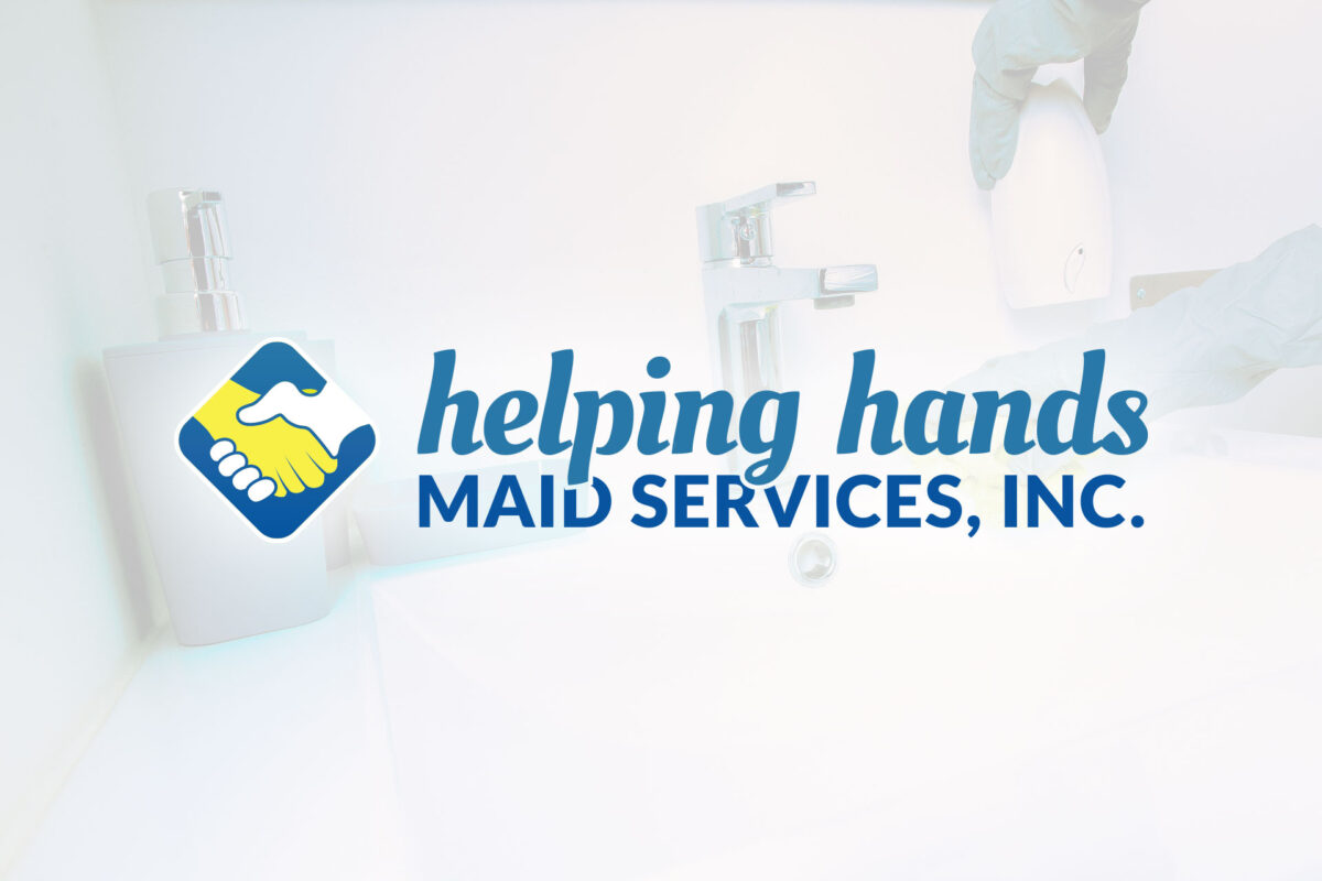
This concept created for a cleaning service makes use of a diamond-shaped mark that was developed to communicate the brand in a variety of settings, whether accompanied by the company’s name or not. I used contrasting typefaces within the logotype to add emphasis to “helping hands” as it is the most distinctive part of the […]
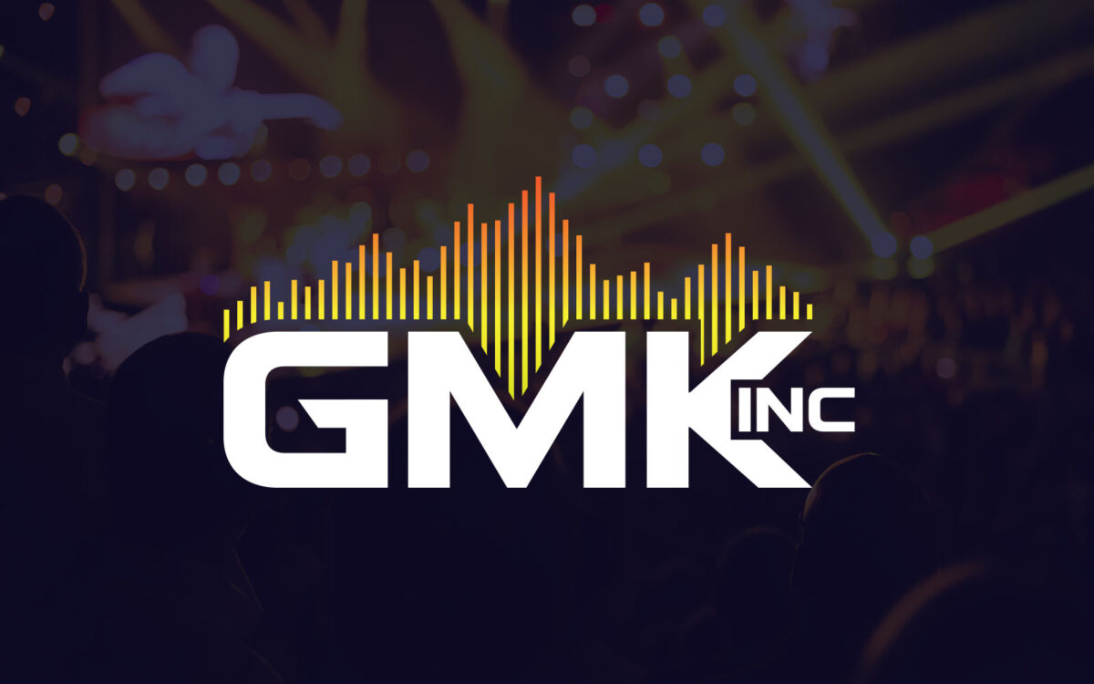
This logo for an audiovisual contractor was meant to harness the reliability and energy behind its product and service offerings. The client enjoyed a robust-looking typeface that was compact enough to read at a small size, paired with a web alternative that carried through a tech-savvy, future-facing sensibility.
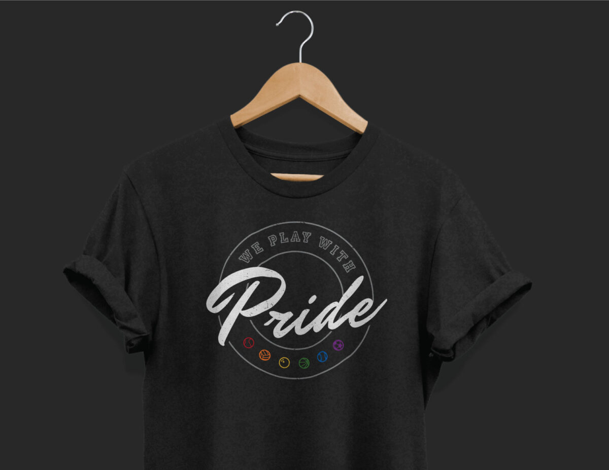
The task for this project was to create a shirt design for an LGBTQ organization’s recreational sports leagues. I leaned into traditional athletic apparel design by pairing a blocky “varsity” style typeface with a script font that brings to mind a sense of motion and fun. Adding a gritty texture added a weather-beaten, lived-in feel. […]
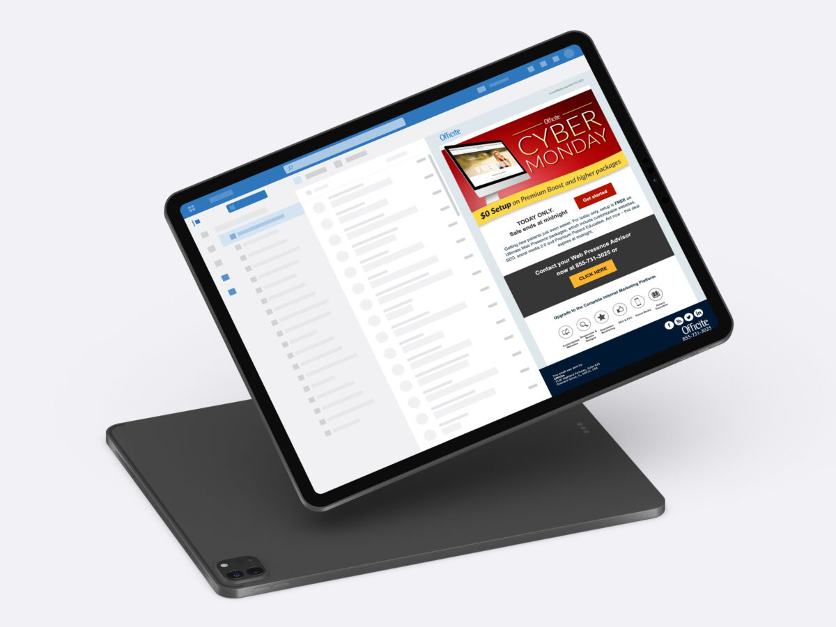
This email was part of a promotional campaign for a B2B company to supplement its normal monthly marketing efforts. In addition to the visual design, I developed it in HTML.
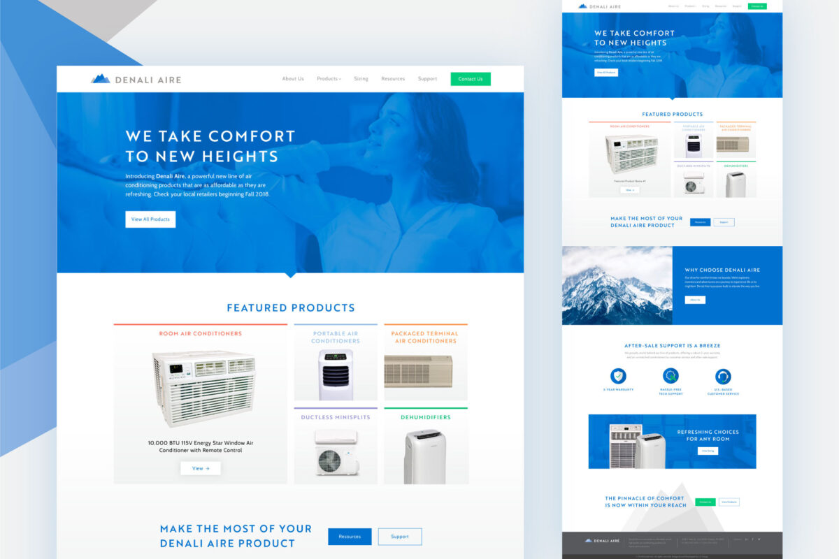
It was a pleasure working on this site for the launch of a new brand of HVAC products, with its crisp, sleek color palette. The selection of bright blues and cool grays offer a taste of the refreshment provided by their air-conditioning units. I used the typography and abstracted triangle shapes from the logo and […]
After being approached by a Chicago jazz/metal fusion group to create a logo, I delivered several options centered around ancient Egyptian themes as they had requested. They were looking for something that could visually resonate no matter the size or application, from posters to merchandise to Spotify. The concept they selected had the promise of […]
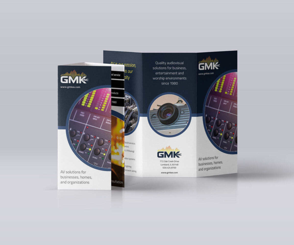
With this brochure design, I wanted to carry over design elements used on the company’s new website to help reinforce their new branding and better represent their market leadership. Due to their work involving sensory experiences, I wanted the bright imagery to take center stage to illustrate the impact of what they offer. I made […]
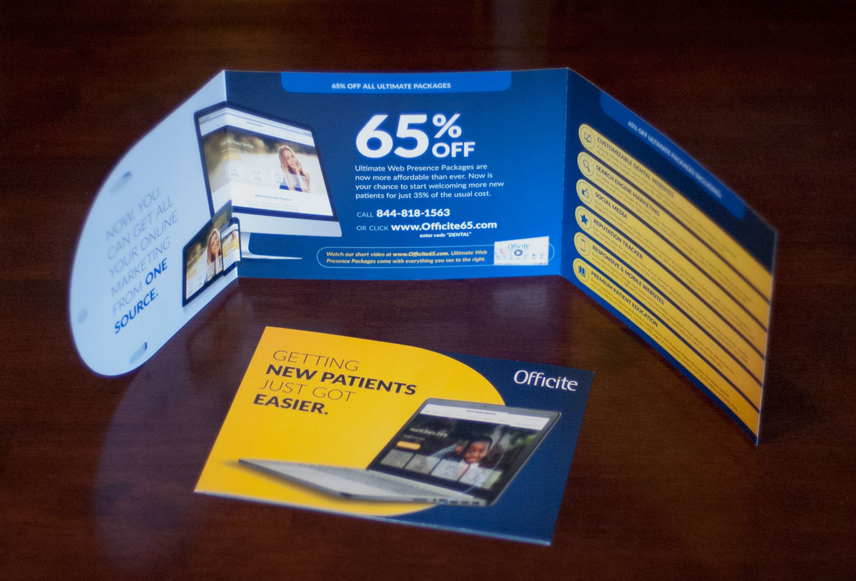
The budget for this co-branded, in-house piece dictated its dimensions, so I worked to make the offer and value proposition as high-impact and clear as possible, while fitting in the other required content with as much hierarchy as possible. One of my favorite techniques for adding a sense of tangibility and value in a design […]