Created for an industrial recycling program, this concept was one of my favorite options conceived in the initial brainstorming phase. I had a lot of fun incorporating subtle graphic symbolism into the geometric typeface, making reference to the program’s function and also to the client’s corporate logomark.
Tag: spotlight
Goes on HP post grid
This looping animation for a social post was a fun challenge – not in the complexity of the finished product, but in creating an organic-feeling flow that successfully showed off the quality designs from a recent web project. I paid great attention to easing and pace in order to keep the designs digestible while still […]
With the client wanting to steer clear of any typical “law”-related imagery, I leaned into the concepts that inspired the name of this legal services app: accessibility, communication, and a positive outlook. Because their platform directly connects users with expert legal practitioners, incorporating a speech bubble was a natural choice, and I found the avenue […]
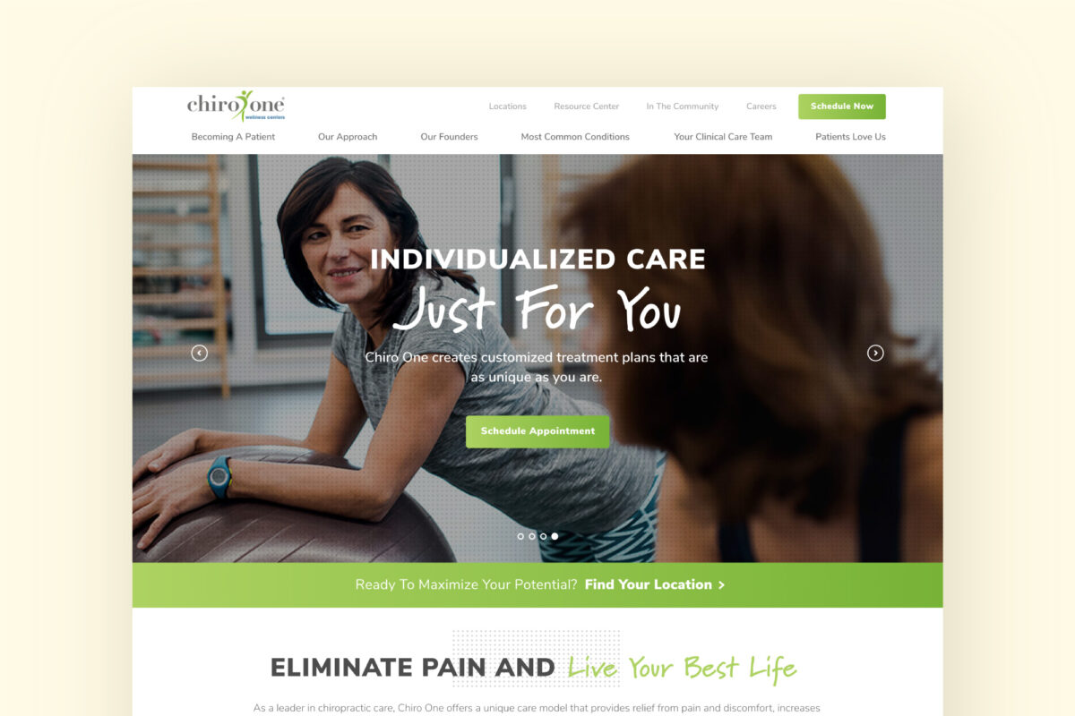
This healthcare client was looking for vibrance and energy in their redesigned website in order to communicate the experience their patients have at their numerous clinics. I used a combination of bold typography styles, bright gradient fills, and numerous interactive components to convey these qualities to users and prospective patients.
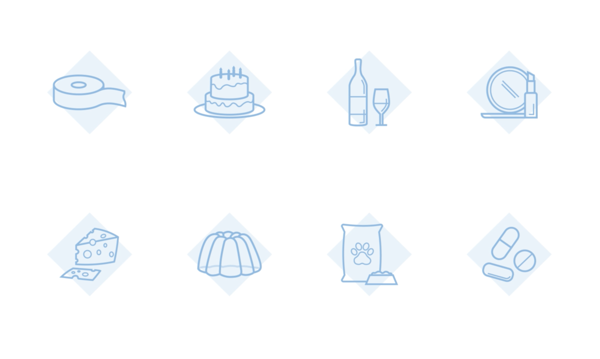
I enjoyed working with trim paths to give life and energy to each of these product category icons that I created as part of an industrial company’s website. Keeping the diamond graphic static in the background was a way of bringing in the aesthetic of the overall web design while making the animation feel less […]
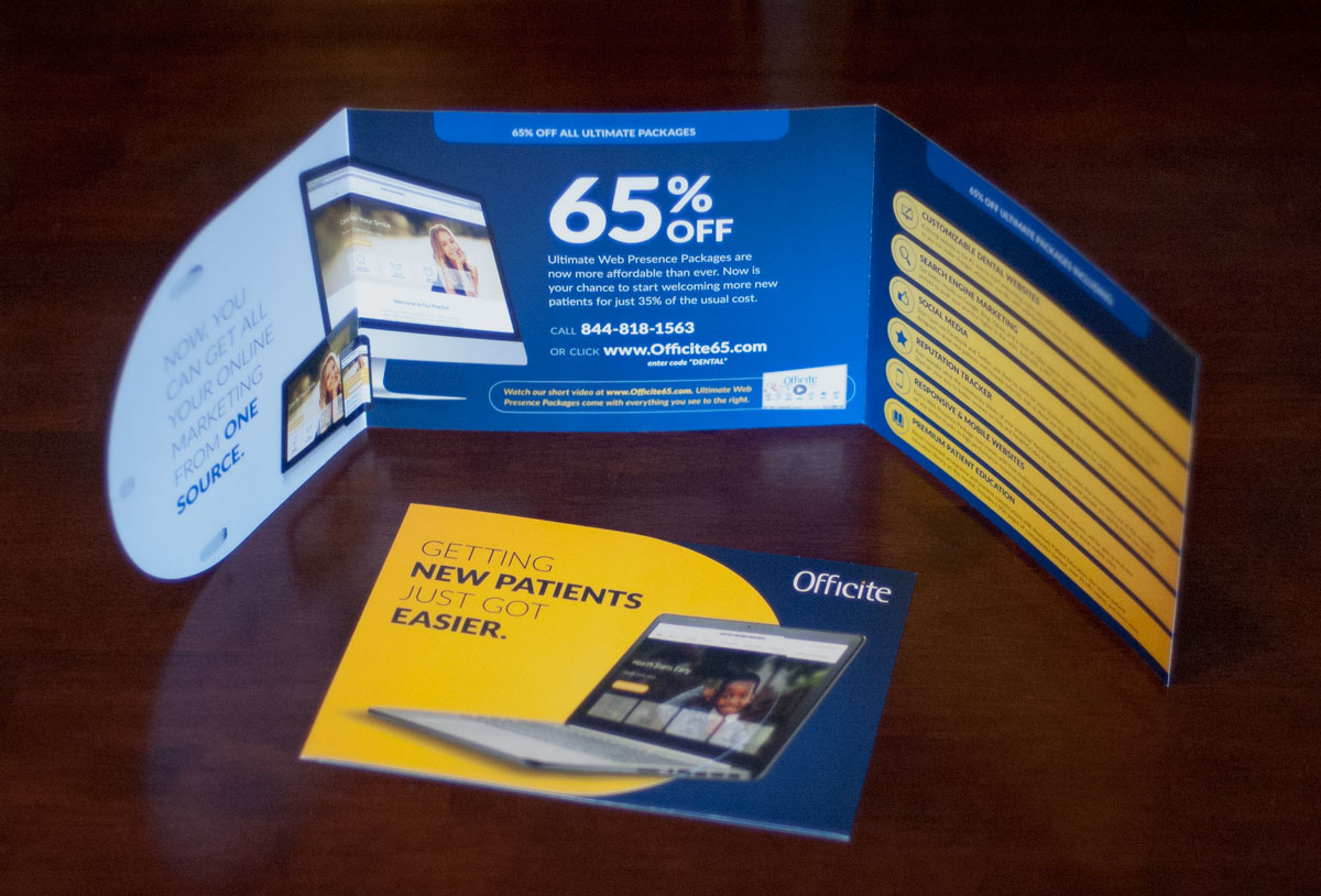
The cover of this direct mail marketing piece features an image overlapping the semi-circular cover flap and the dark blue panel underneath, creating an illusion of the graphic floating on a “plane” above both of those layers. After opening the top two flaps, the marketing offer is displayed in the center as a “conclusion” to […]
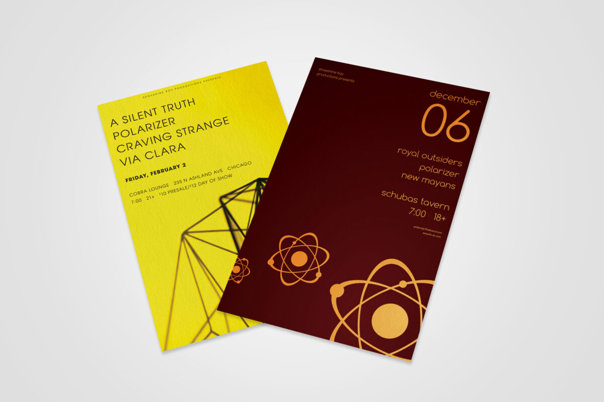
This series of concert posters represents the exploration of a minimalist, geometric-inspired aesthetic that tied in with an independent band’s musical genre and established visual presence. The cleanliness and uncluttered nature of the designs, as well as the high-contrast color choices, was helpful in that most concertgoers primarily digested them on mobile social apps, rather […]