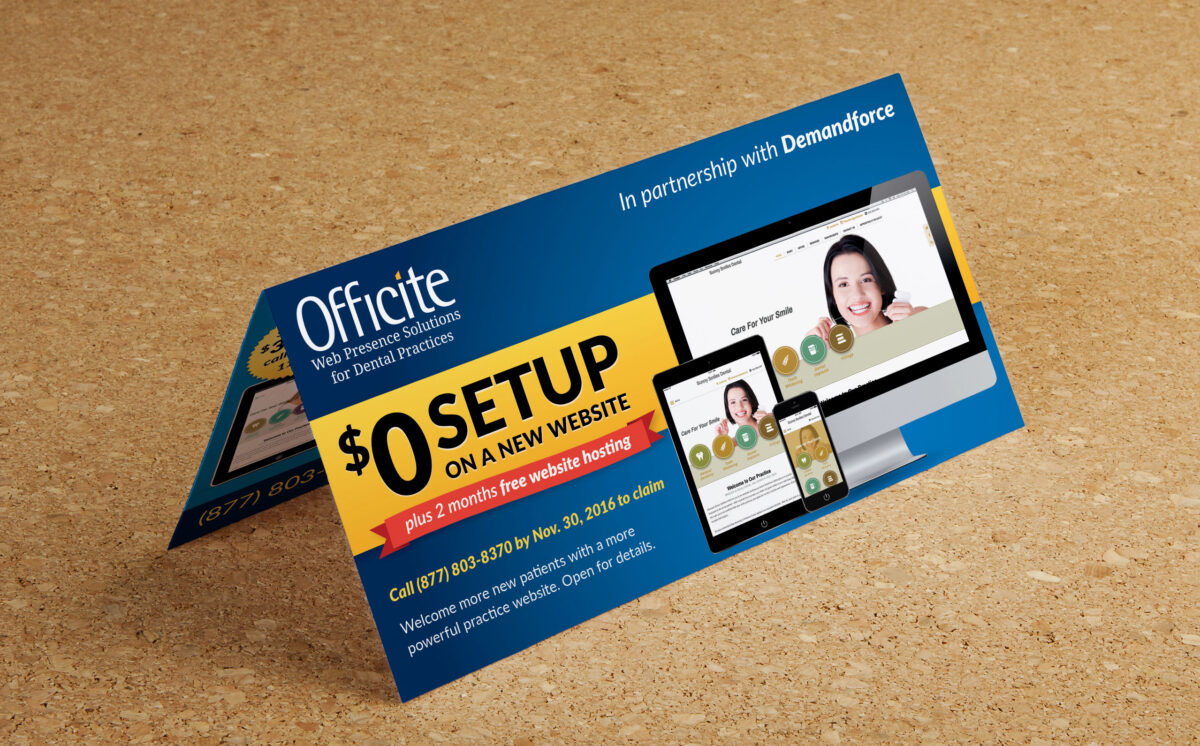
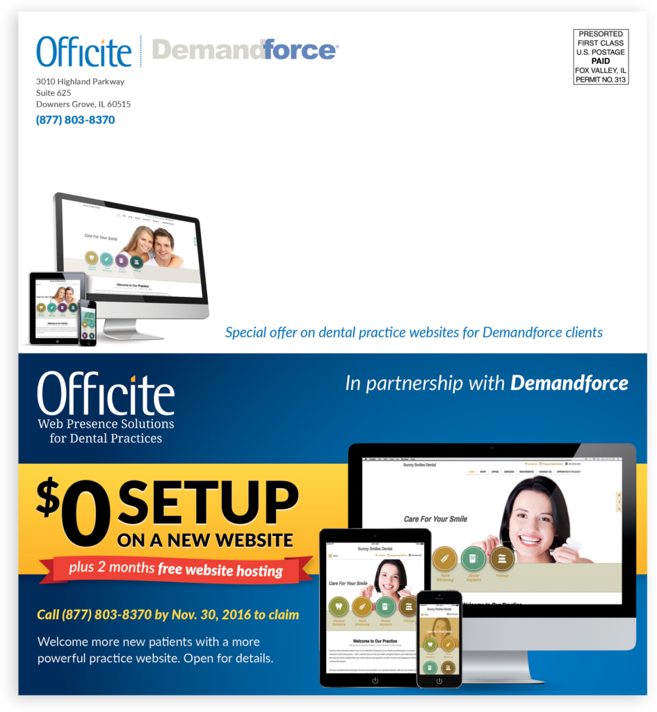
The budget for this co-branded, in-house piece dictated its dimensions, so I worked to make the offer and value proposition as high-impact and clear as possible, while fitting in the other required content with as much hierarchy as possible.
One of my favorite techniques for adding a sense of tangibility and value in a design is to subtly imply dimensionality in the graphics and some text elements through understated gradients and shadows.


