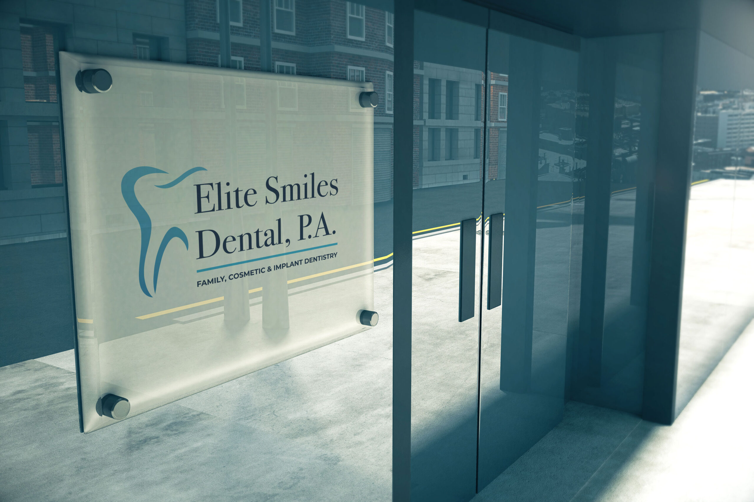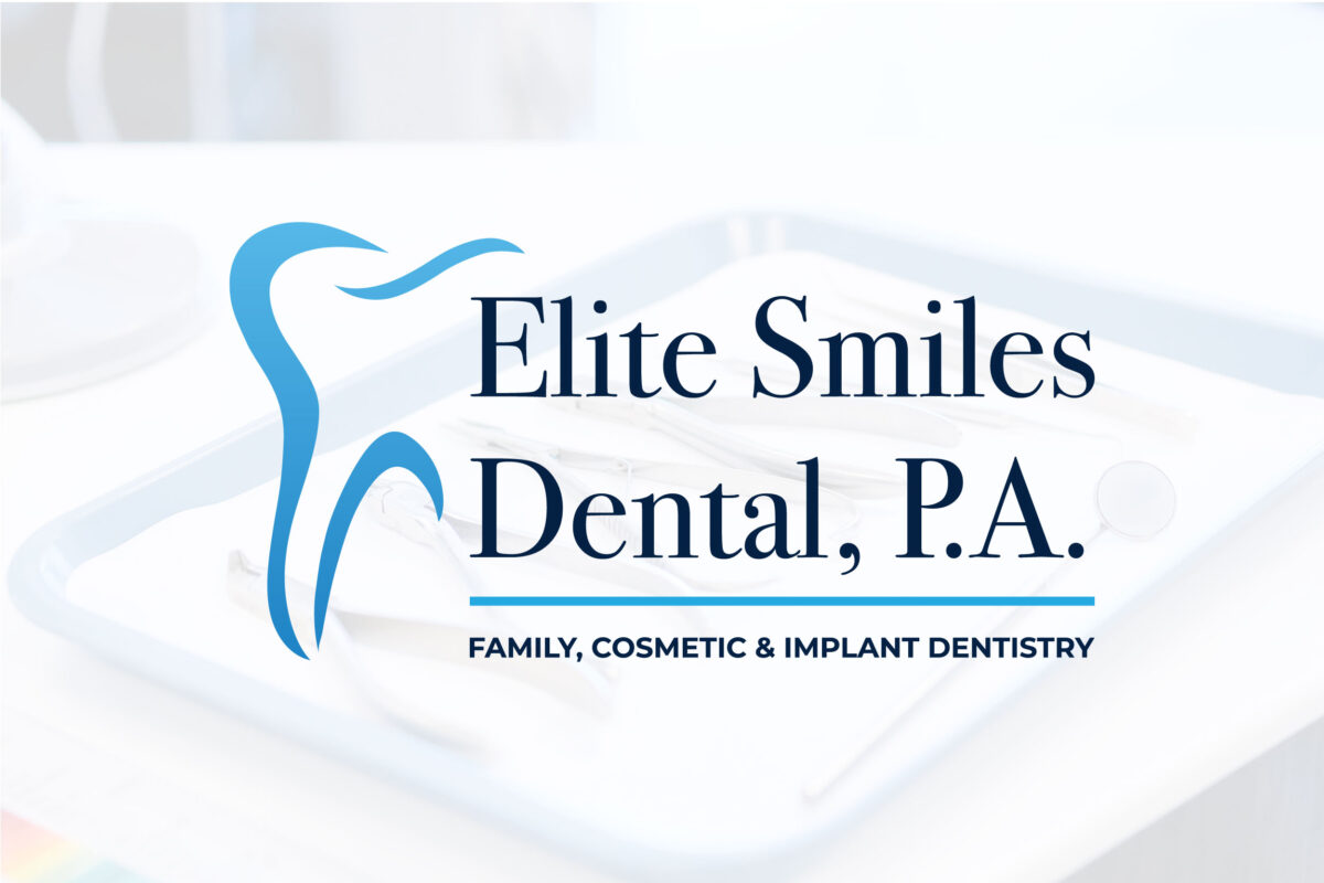
This dentist was seeking a sophisticated, clean identity that matched his practice’s atmosphere and clientele. I chose an elegant serif as the primary typeface to convey that sense of class, paired with a modern sans serif for the smaller secondary words in the name.
The stylized tooth icon interacts with the typography in a way that is sleek and space efficient, which lends more impact to the logo in myriad applications.