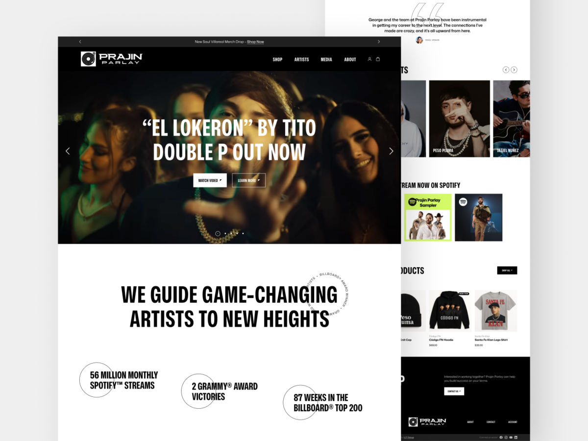
When I learned I had the chance to design a website for a successful record label, it was music to my ears. Having done work in various roles in that industry, I felt I could bring depth and understanding to the digital presentation and functionality.
The client didn’t have a strict idea of what they were looking to see, so I based my creative concepts on my own research into their competition and trends in the marketplace. The results involved a minimal color palette, which let the abundant images and videos do the heavy lifting, and overlapping, asymmetric layouts, which is something I rarely work with but fit great here. Touches of animation gave it a polished, modernized feel.