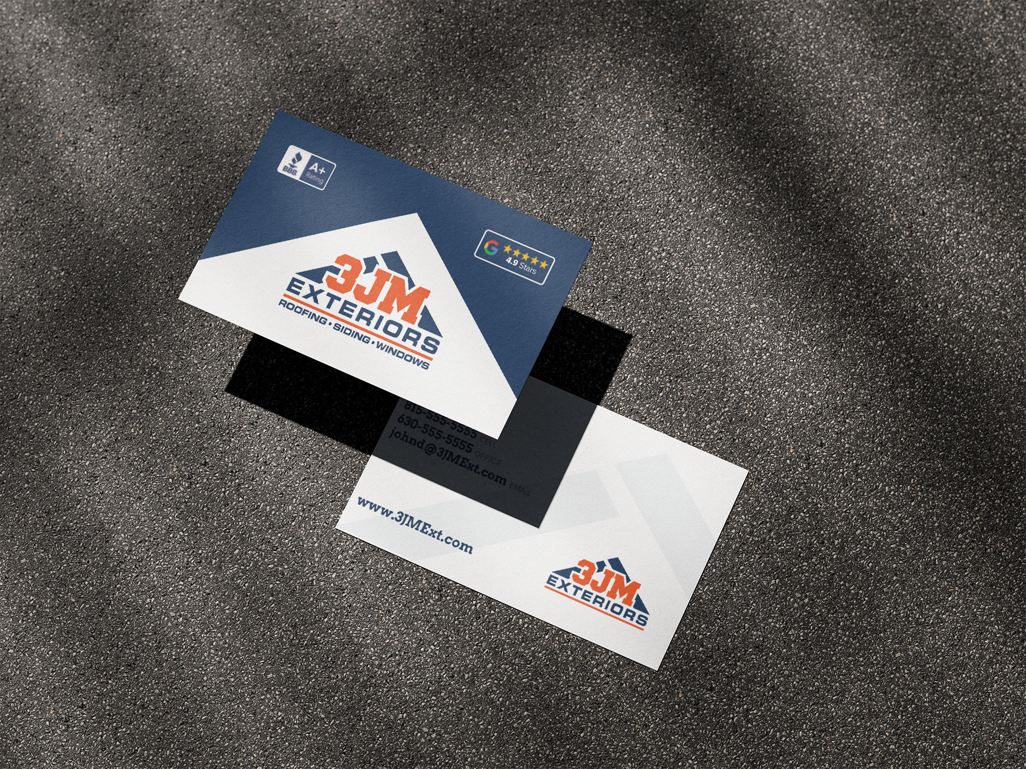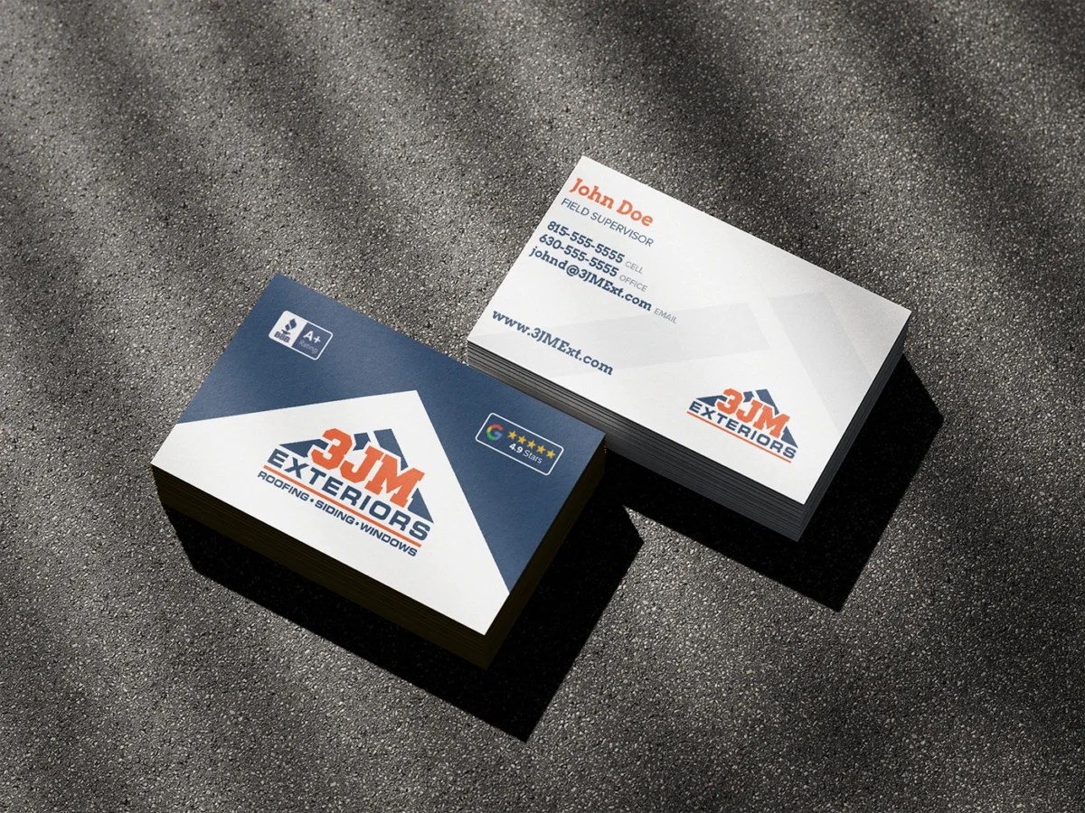
This construction company was looking for business cards that extended their existing brand, which is known for distinctive diagonal lines, bold colors and other elements that reflect strength and trustworthiness.
I thought “big” with their mark, using it both as a cropped watermark on one side and as an enclosing silhouette on the other side, which brings energy and stability to the designs as well as tying into their visual identity.
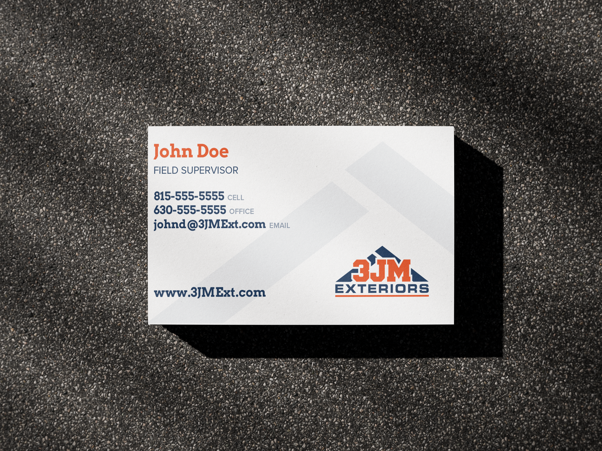
For typography, I kept it clean and simple, giving ample size to the contact information to make it easy for their clients to read and find what they need to know.