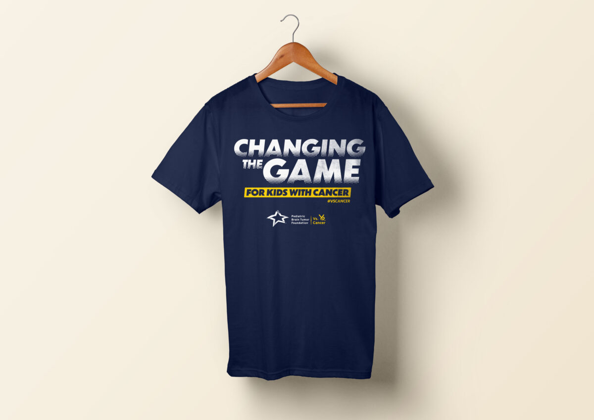
This design was created for use on the Pediatric Brain Tumor Foundation’s 2021 athletic event shirts. My goal was to continue to reflect the organization’s brand identity and fit within a sports environment while offering a design that stood out from previous years. Something I enjoy doing when presented with a limited number of production […]
Category: Print
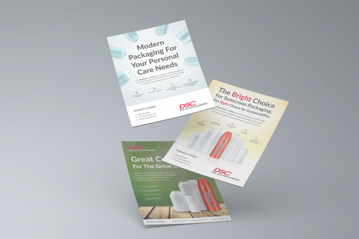
My challenge for these B2B publication ads was to explore fresh visual concepts within strict guidelines on how the product renderings were to appear, and to make the same call-to-action work within several different themes. The client preferred a fairly minimal approach that emphasized the products, so I explored solutions that involved large display type […]
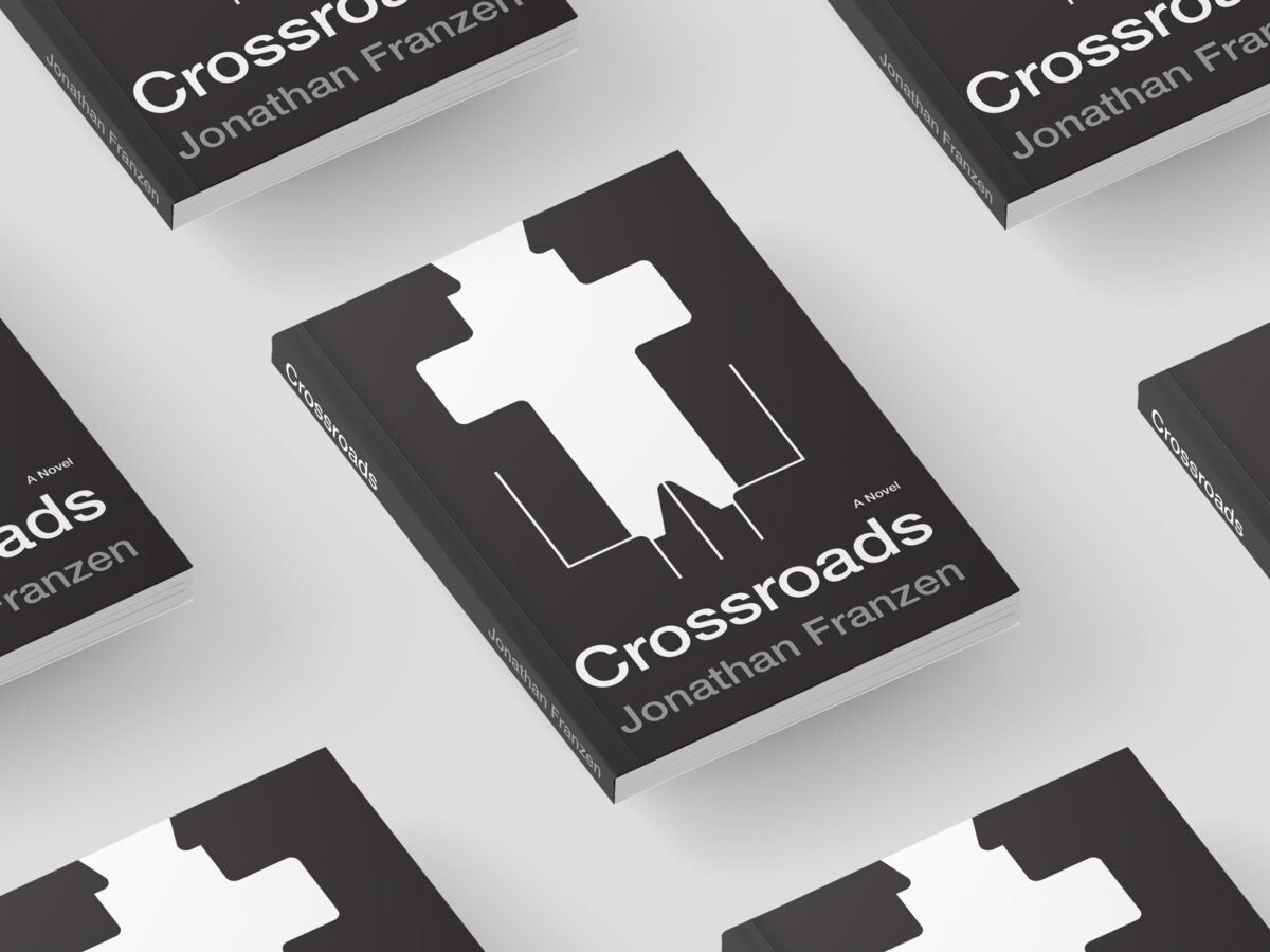
I had a blast creating this concept for a book I recently enjoyed reading. The design leans into a flat, minimalist aesthetic to convey the subject of this novel, which explores family relationships around a 1970s suburban Chicago church. This approach to illustration, containing only essential details but each element packed with meaning, greatly intrigues […]
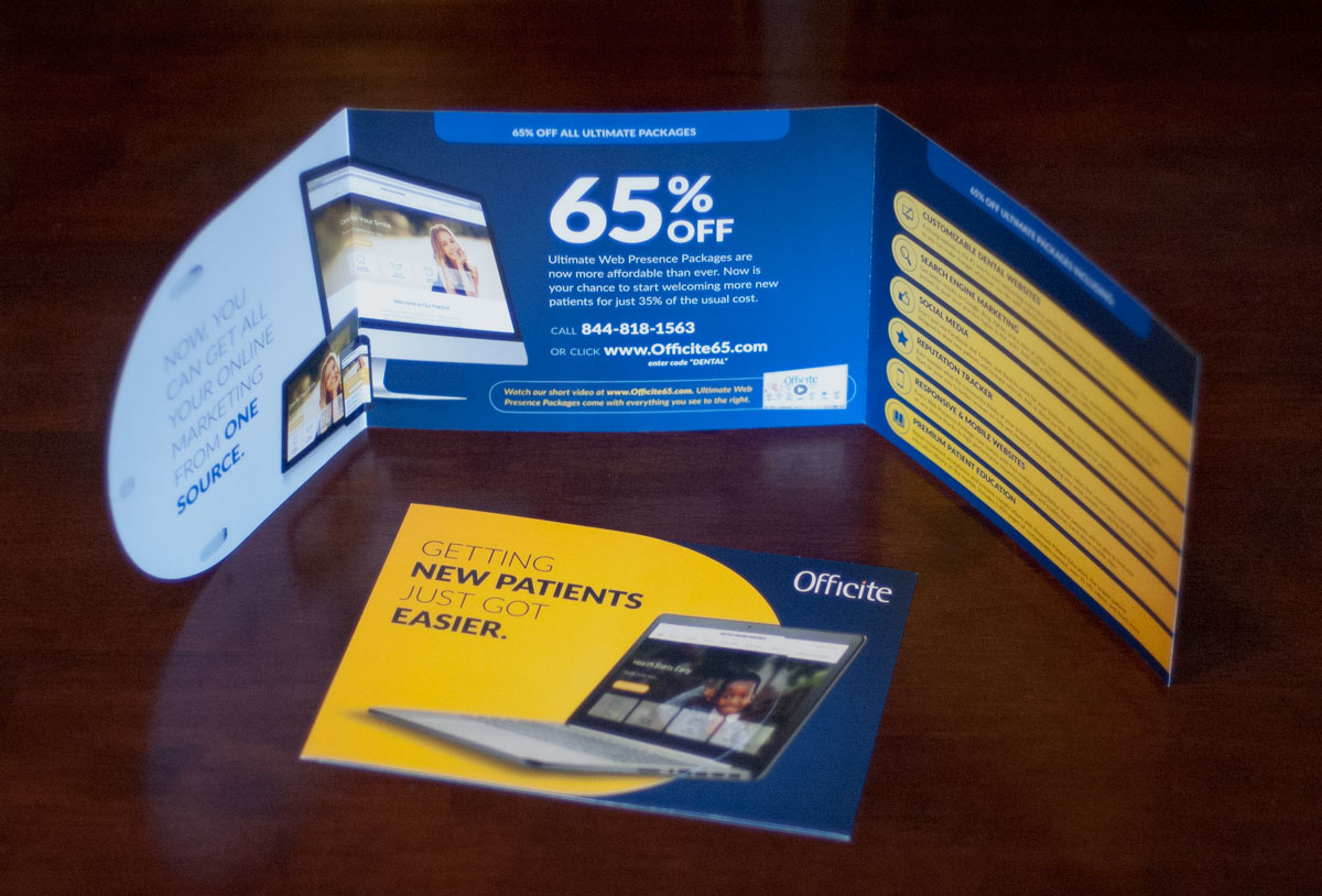
The cover of this direct mail marketing piece features an image overlapping the semi-circular cover flap and the dark blue panel underneath, creating an illusion of the graphic floating on a “plane” above both of those layers. After opening the top two flaps, the marketing offer is displayed in the center as a “conclusion” to […]
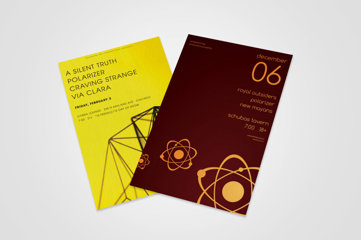
This series of concert posters represents the exploration of a minimalist, geometric-inspired aesthetic that tied in with an independent band’s musical genre and established visual presence. The cleanliness and uncluttered nature of the designs, as well as the high-contrast color choices, was helpful in that most concertgoers primarily digested them on mobile social apps, rather […]
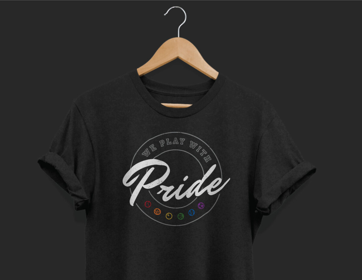
The task for this project was to create a shirt design for an LGBTQ organization’s recreational sports leagues. I leaned into traditional athletic apparel design by pairing a blocky “varsity” style typeface with a script font that brings to mind a sense of motion and fun. Adding a gritty texture added a weather-beaten, lived-in feel. […]
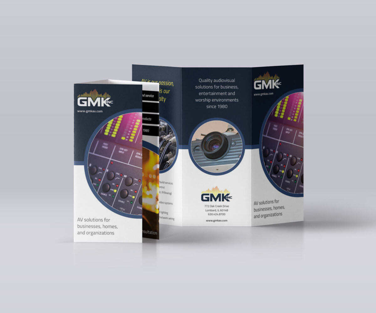
With this brochure design, I wanted to carry over design elements used on the company’s new website to help reinforce their new branding and better represent their market leadership. Due to their work involving sensory experiences, I wanted the bright imagery to take center stage to illustrate the impact of what they offer. I made […]
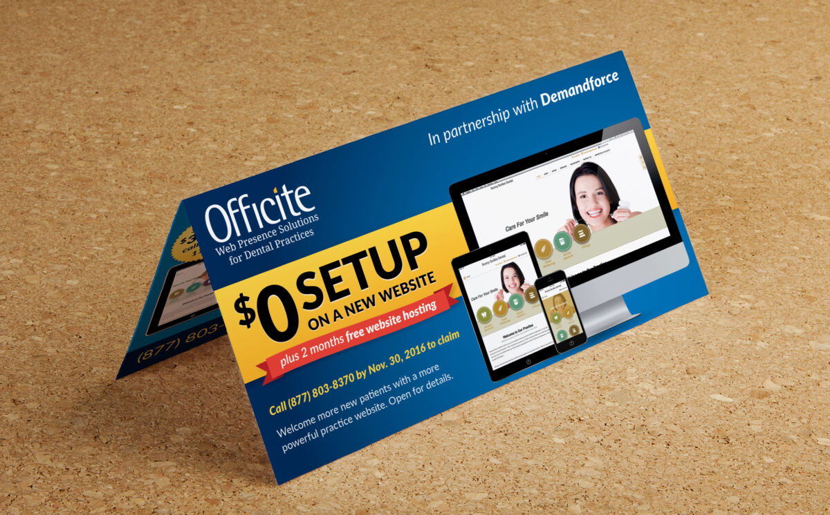
The budget for this co-branded, in-house piece dictated its dimensions, so I worked to make the offer and value proposition as high-impact and clear as possible, while fitting in the other required content with as much hierarchy as possible. One of my favorite techniques for adding a sense of tangibility and value in a design […]