As I redesigned this supplement manufacturer’s website, I worked to leverage the color scheme and diamond graphic elements their customers were already familiar with into something that felt fresh and more cutting-edge. Custom touches like the rotating-diamond hover effect on the buttons and translucent illustrations help the company introduce their audience to a brand new […]
Category: Design
This client in the food ingredient-distribution space was seeking bold colors, captivating imagery, and a sense of motion for their redesigned website. I developed an aesthetic for their new digital experience that features those elements in spades, adding in illustrative touches for an extra dose of personality. Because a key focus of the site was […]
This design was created for use on the Pediatric Brain Tumor Foundation’s 2021 athletic event shirts. My goal was to continue to reflect the organization’s brand identity and fit within a sports environment while offering a design that stood out from previous years. Something I enjoy doing when presented with a limited number of production […]
This dentist was seeking a sophisticated, clean identity that matched his practice’s atmosphere and clientele. I chose an elegant serif as the primary typeface to convey that sense of class, paired with a modern sans serif for the smaller secondary words in the name. The stylized tooth icon interacts with the typography in a way […]
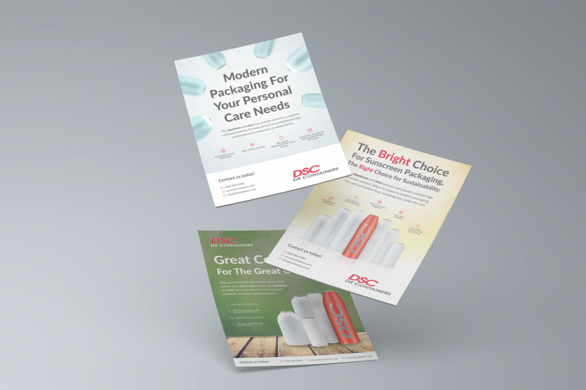
My challenge for these B2B publication ads was to explore fresh visual concepts within strict guidelines on how the product renderings were to appear, and to make the same call-to-action work within several different themes. The client preferred a fairly minimal approach that emphasized the products, so I explored solutions that involved large display type […]
The cover of this direct mail marketing piece features an image overlapping the semi-circular cover flap and the dark blue panel underneath, creating an illusion of the graphic floating on a “plane” above both of those layers. After opening the top two flaps, the marketing offer is displayed in the center as a “conclusion” to […]
This series of concert posters represents the exploration of a minimalist, geometric-inspired aesthetic that tied in with an independent band’s musical genre and established visual presence. The cleanliness and uncluttered nature of the designs, as well as the high-contrast color choices, was helpful in that most concertgoers primarily digested them on mobile social apps, rather […]
This concept created for a cleaning service makes use of a diamond-shaped mark that was developed to communicate the brand in a variety of settings, whether accompanied by the company’s name or not. I used contrasting typefaces within the logotype to add emphasis to “helping hands” as it is the most distinctive part of the […]
This logo for an audiovisual contractor was meant to harness the reliability and energy behind its product and service offerings. The client enjoyed a robust-looking typeface that was compact enough to read at a small size, paired with a web alternative that carried through a tech-savvy, future-facing sensibility.
The task for this project was to create a shirt design for an LGBTQ organization’s recreational sports leagues. I leaned into traditional athletic apparel design by pairing a blocky “varsity” style typeface with a script font that brings to mind a sense of motion and fun. Adding a gritty texture added a weather-beaten, lived-in feel. […]