This simple animation based on an original freehand design was created for a corporate social post. Sláinte!
Author: Ian
This healthcare client was looking for vibrance and energy in their redesigned website in order to communicate the experience their patients have at their numerous clinics. I used a combination of bold typography styles, bright gradient fills, and numerous interactive components to convey these qualities to users and prospective patients.
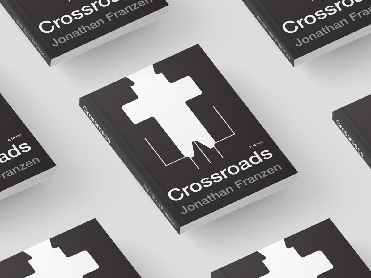
I had a blast creating this concept for a book I recently enjoyed reading. The design leans into a flat, minimalist aesthetic to convey the subject of this novel, which explores family relationships around a 1970s suburban Chicago church. This approach to illustration, containing only essential details but each element packed with meaning, greatly intrigues […]
To mark the NFL Raiders franchise’s 2020 relocation to Las Vegas, I thought it was time to consider a brand refresh that was more appropriate for the team’s new home, while retaining many of the familiar aspects that fans have loved for decades, such as the distinctive shield design and sleek silver-and-black color palette. The […]
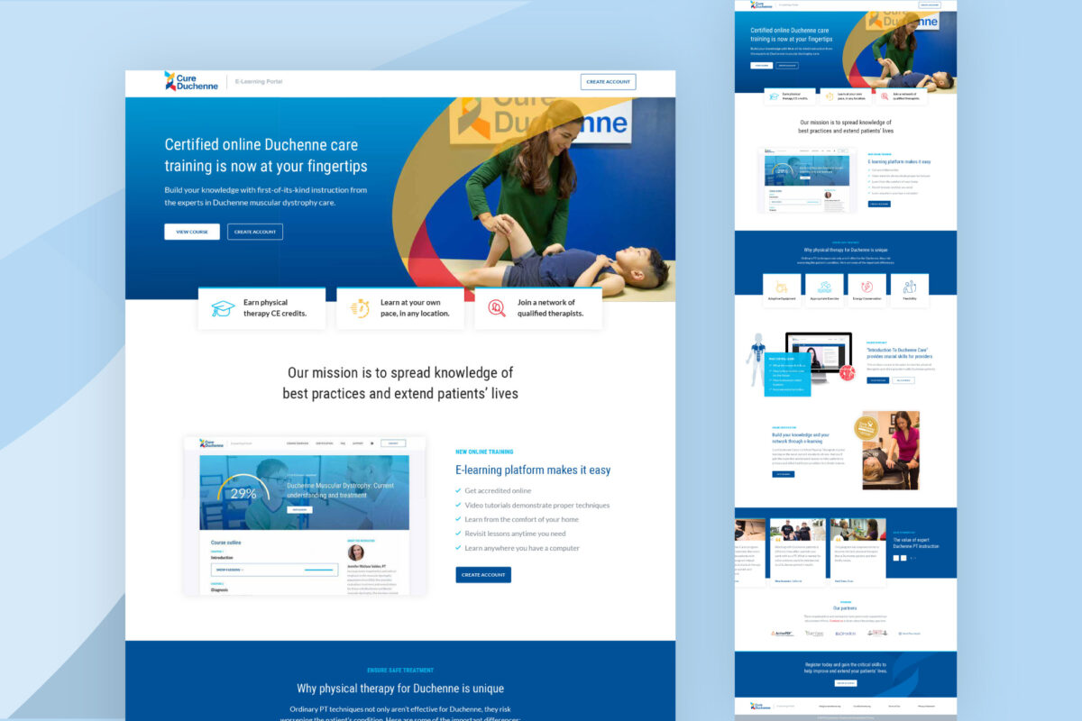
In approaching the design for this e-learning course and landing page, I wanted to translate the client’s expertise and authority in the subject matter into an engaging, intuitive experience for the user. One of the challenges in creating the visual styles was to find the right tonal balance between the gravity of a serious pediatric […]
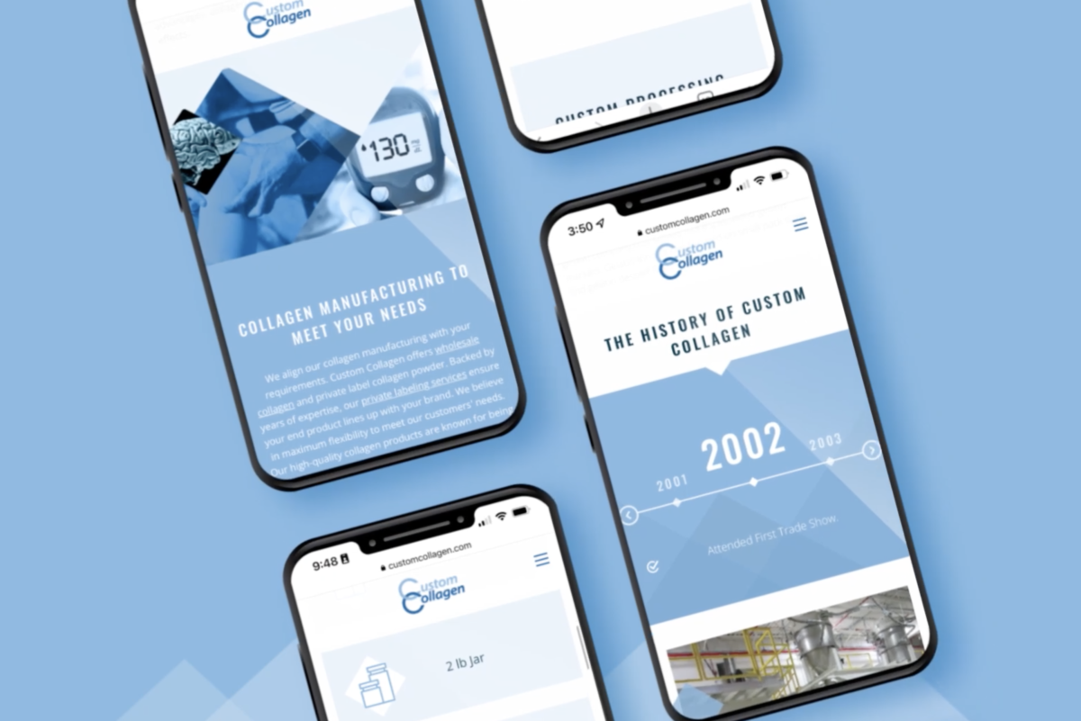
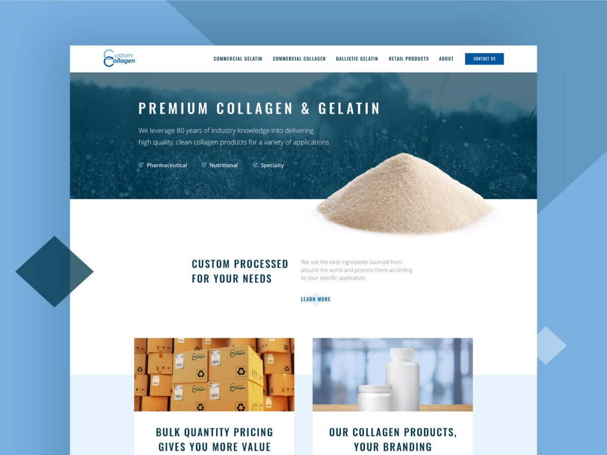
As I redesigned this supplement manufacturer’s website, I worked to leverage the color scheme and diamond graphic elements their customers were already familiar with into something that felt fresh and more cutting-edge. Custom touches like the rotating-diamond hover effect on the buttons and translucent illustrations help the company introduce their audience to a brand new […]
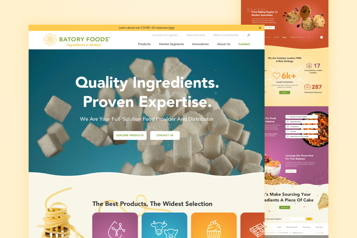
This client in the food ingredient-distribution space was seeking bold colors, captivating imagery, and a sense of motion for their redesigned website. I developed an aesthetic for their new digital experience that features those elements in spades, adding in illustrative touches for an extra dose of personality. Because a key focus of the site was […]
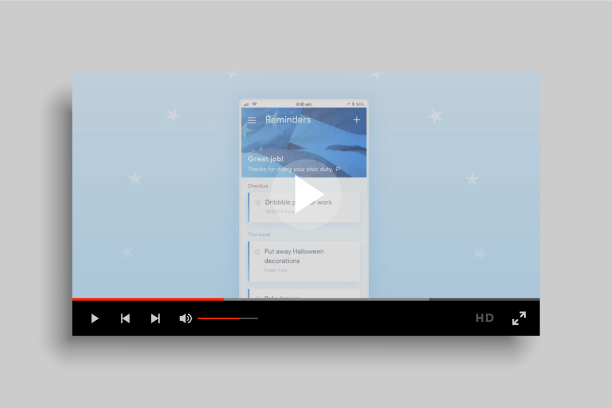
This animation of a smartphone reminder app was part of a social media post promoting participation in the midterm election. Did you remember to vote?
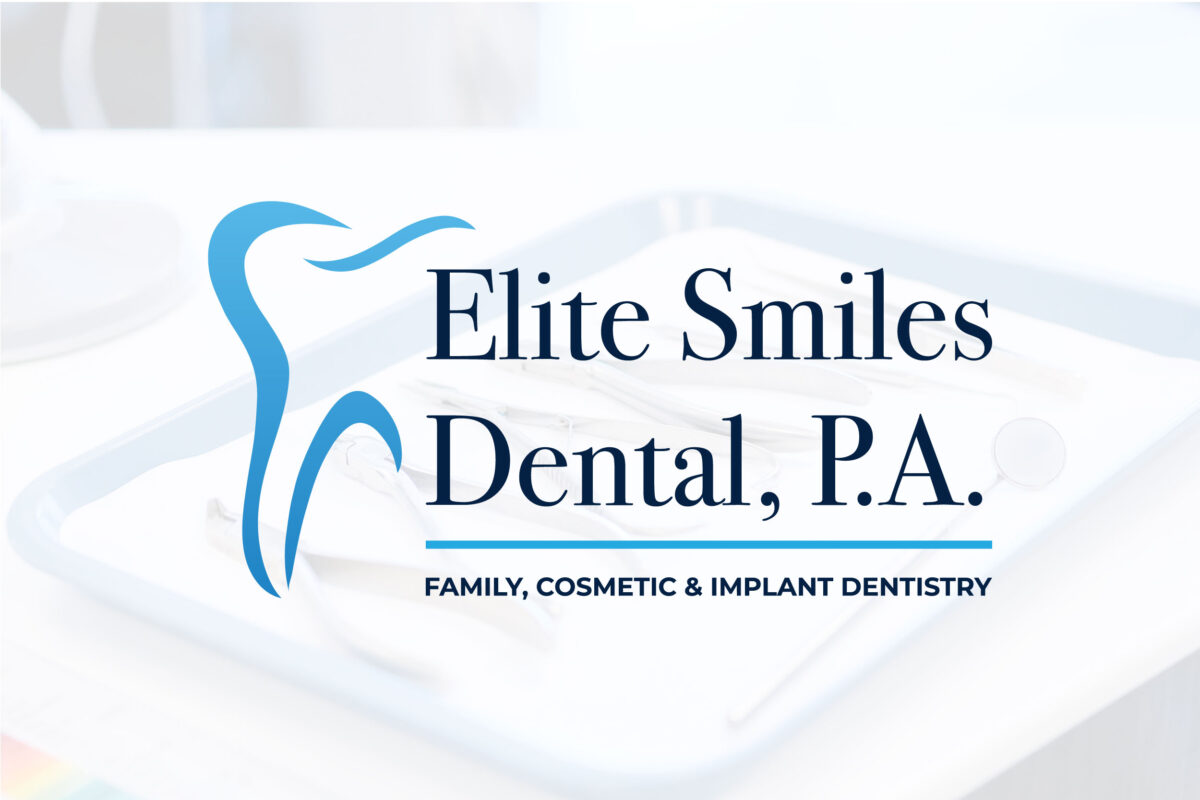
This dentist was seeking a sophisticated, clean identity that matched his practice’s atmosphere and clientele. I chose an elegant serif as the primary typeface to convey that sense of class, paired with a modern sans serif for the smaller secondary words in the name. The stylized tooth icon interacts with the typography in a way […]
I enjoyed working with trim paths to give life and energy to each of these product category icons that I created as part of an industrial company’s website. Keeping the diamond graphic static in the background was a way of bringing in the aesthetic of the overall web design while making the animation feel less […]